Hey Team,
Ok so, I (shockingly) actually have a background in web design, and have been considered a very creative and artsy person. However, I SUCK at making decisions. I am extremely indecisive (except when I'm being impulsive, in which case I am VERY decisive) and it I feel limits my creativity, so I frequently will end up with simply what felt least scary...or what is I suppose the middle ground. Basically I'm the person who spends half an hour deciding which flavor ice cream to choose and then end the end will never be happy because I doubt whether or not I made the correct decision.
So all that being said, I need help. I decided to spruce up the place a bit- rearranged some of my links- added the "popular posts" widget (which was very interesting for me actually) and then decided, why not change the blog background. I feel pretty good about it (I spent sadly way too long for this to be the end result). I like the clean lines and the simplicity. The other pattern was feeling a little busy for me.
But part of me wants to go bold and like completely change- re: abandon the pink. Now. We are getting there- we're in lilac now. But my attachment to pink on this blog is a bit strange. Pink is not my favorite color (my favorite color for the record is periwinkle), and yet I feel like it must be incorporated into the blog in some way. I am a bit believer in tradition and history and I like that this blog started out as like a pink extravaganza, and it links to the Princess theme. I worry that if I get too far from that, am I abandoning or changing the identity of the blog? Is the girly nature of the blog part of its appeal? I don't know.
So this template (Design 1) attracted me bc in its original state it was super clean- lots of white, etc. And I kinda went to the middle (there was another one I was considering that was SUPER pink), and I'm not sure if watered down is the way to go.
So opinions and ideas (or coding and images if you're wanting to share your blog template with me, lol) would be very much appreciated! I'm going to keep working on this today, so things may keep changing. If you happen in and you have strong feelings for the one that's up at that moment- please let me know!
xoxo
Princess Kelley
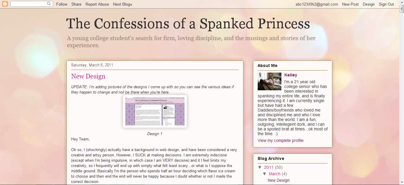
UPDATE: I'm adding pictures of the designs I come up with so you can see the various ideas if they happen to change and not be there when you're here.
Design 7

Design 6

Design 5

Design 4

Design 3

Design 2

Design 1
Update 2: Ok, so I'm not sold on any of these. And it doesn't seem like any of you guys are too. HELP please! Let me try to get some basic questions answered
1. Pink- keep it, leave it? Is there an identity issue?
2. Dark colors with light text, or light colors with dark text?
3. Simple and clean, or artsy and fresh?
4. Photos in the background, yes or no?
I like designs six and seven, the top two. Seven is pretty, but I find six easier on the eyes with its deeper colours.
ReplyDeleteI sorta like #1.
ReplyDeleteKelley,
ReplyDeleteStop right there. I prefer this one!
Hugs,
Bonnie
You're probably going to hate me for saying this, but I'll say it anyway: Whatever design best fits the general theme is what you should go with.
ReplyDeleteGood Luck and Take Care :)
I like #6 and the one you have now. The pink ones are too bright, and the wallpaper on #1 is too monotonous. I'm sure an exact opposite response to the first one, Little Butterfly, helps with your indecision. :)
ReplyDeleteRedchief
I also like number 6, and also number 1, so if nothing else you can tell some of your designs are getting nil points :)
ReplyDeleteI'm not normally a fan of picture backgrounds on blogs in general, because I always find it slightly offputting that the background doesnt move when you scroll up or down the page. Maybe thats just me though and nobody else minds as much.
Adrian
I like what you have now, the blue with white flowers for a background. Light text on a dark page. Looks great.
ReplyDeleteThe pink we should have is your glowing bottom.
ReplyDeleteThe white flower background, With light text on a dark page looks great. Of course you could be really different and depending on what mood your in for that day's post..Bold for mad, excited or light colors for a happy cheerful mood. The ultimate decision is yours. And because its your decision there can't be a bad one.
...On second thought, if you're going to use a design that includes a background photo, the fourth photo from "The Photos You Never Got To See" posting (2 - 12 - 11) would be great. To me, that image says it all. It's very complimentary to the blogsite's title as well.
ReplyDelete